Code Documentation
Project Structure
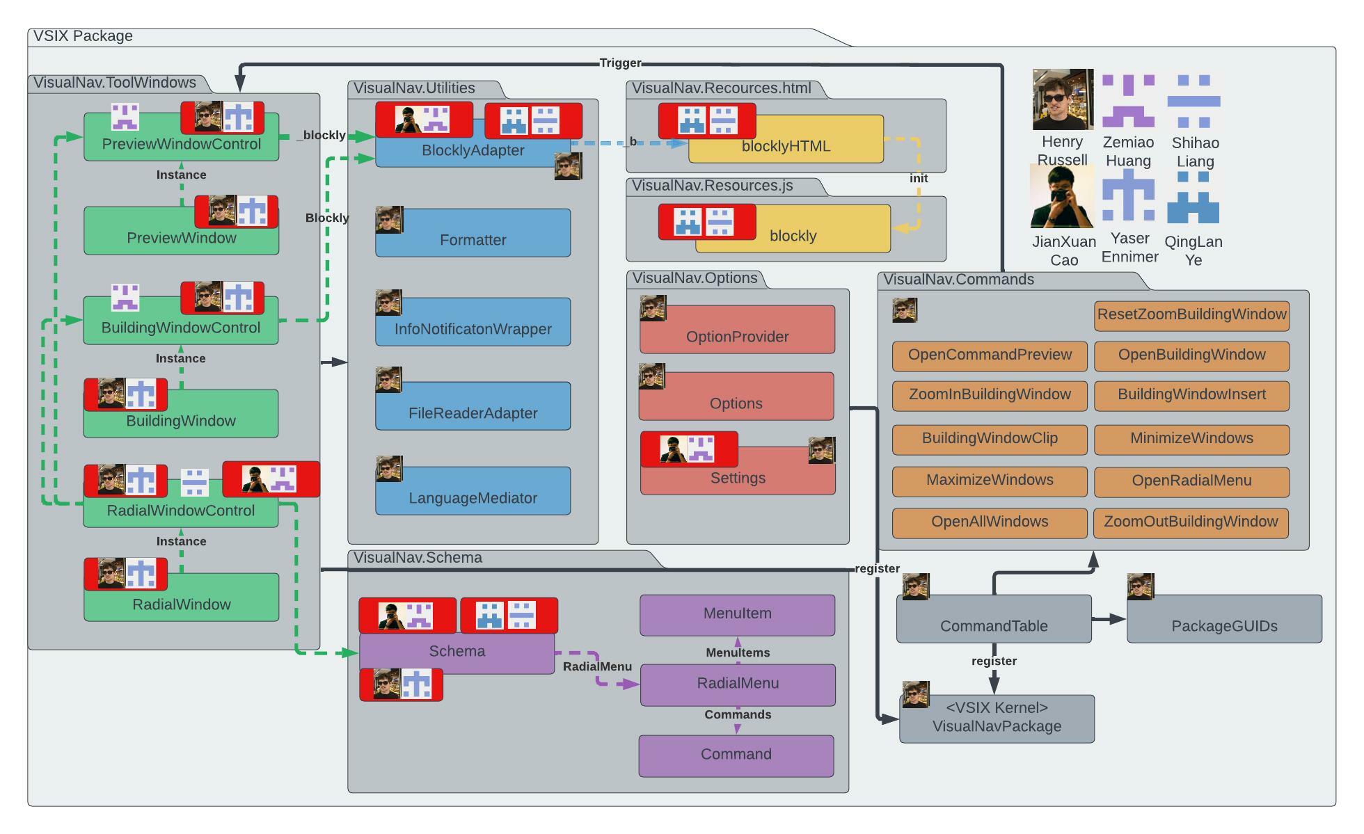
In this project, a system of pair programming on certain files was used. Tasks were assigned to pairs and each pair had a lead. In the Henry-Yaser pair, Henry was the lead. In the Shihao-Qinglan pair, Shihao was the lead. In the Jianxuan-Zemiao pair, Jianxuan was the lead. It is worth noting that some modules on this diagram required more effort than others.
The solution is divided into Commands, Options, Schemas, Tool Windows, and Utilities. Extension components are registered to a Visual Studio core using a Microkernel architecture.
For registering tool windows, settings, and startup code, use "VisualNavPackage."
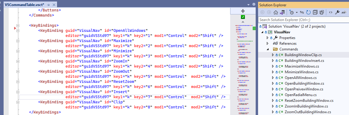
The commands and corresponding shortcuts are stored in a table called "VSCommandTable."
GUIDs (global unique IDs) are referenced here and can be used to access toolwindows windows, eg. to make it "full screen" among other things.
To avoid conflict and pass the VS extension marketplace inspections, every GUID here should be generated again before publishing a branch of this application.
For extending blockly further,
· Blockly/media/: stores sound and animation
· Blockly/blocks/: stores the built-in blocks, and the files are organized based on the type of blocks (math, list, loop, etc.).
· Blockly/core/: stores the essential functions to manipulate the blocks and workspace, such as event handler, renderers, and utility functions.
· Blockly/generators/: stores the code generators used to paraphrase the blocks to high-level programming language
Tool Windows 🪟
WPF is used to create tool windows. XAML defines the layout structure of each WPF tool window, our primary panel layouts were grid and stack. Each XAML file has a controller that specifies its behaviour and may be expanded in the solution explorer. Content and labels for each window can be dynamically resized using the current width and height ratios, with maximum and minimum sizes in their controller classes.
Radial Menu Tool window
We used a model described as Pie Menus https://www.billbuxton.com/PieMenus.html (Buxton, 1998). This was an important UI design metaphor for categorising and subcategorising menus. This when coupled with UCL MotionInput 3 Facial Navigation gives a whole new unique metaphor for navigating deeply nested menus with minimal movement around a central axis.
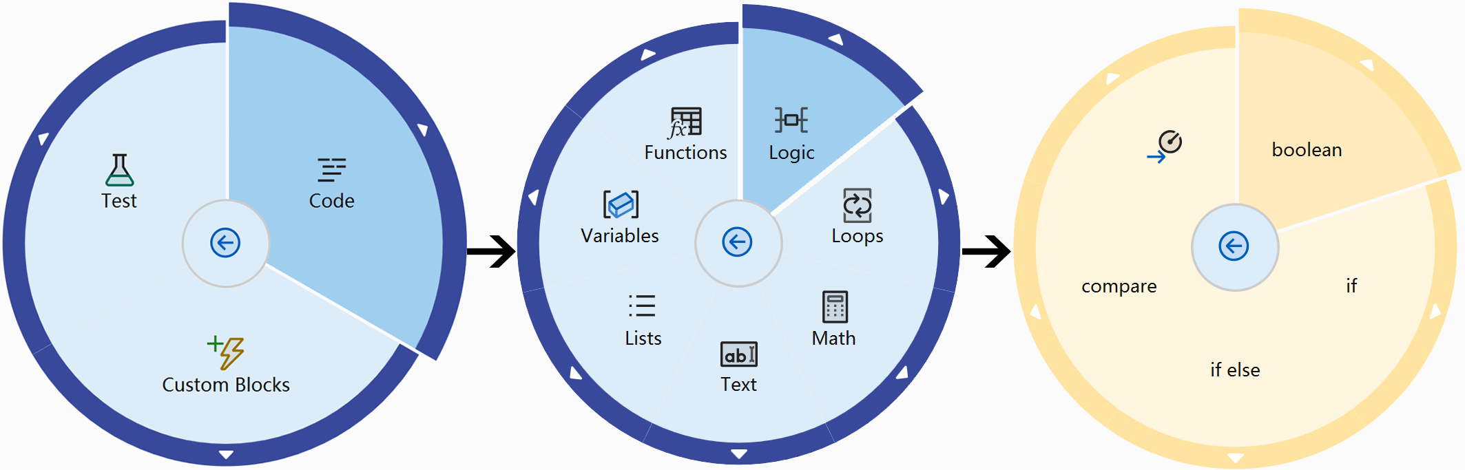
We used the library https://github.com/Julien-Marcou/RadialMenu, the foundation of the menu, with customizations such as increasing the radius size on segment hover.
A method to construct the menu is invoked each time a file is loaded; this method reads the JSON configuration and renders each item depending on its type, assigning handler functions and "next page". If a custom block is added, the process is also invoked.
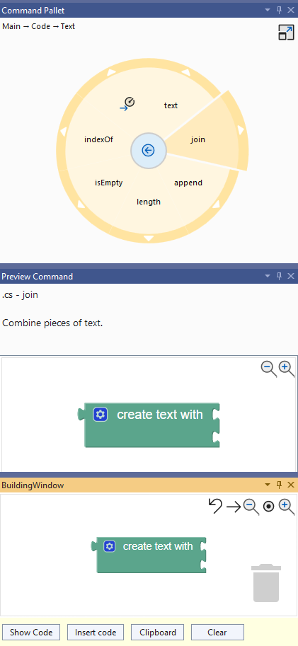
Preview Tool window
A separate tool window for the preview. It has its own Blockly browser instance. When a menu item is hovered over, preview functionalities are activated, with differing behaviour for commands and menu headings.
Updates are sent as asynchronous JavaScript commands via the bridge to update the preview Blockly instance on hover entry and exit. To guarantee that only one preview item is presented at once, mutual exclusion is necessary.
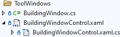
Building window
Loads a browser to allow the user to assemble blocks and transform them to code, it handles additional interactions that call utility functions such as BlocklyAdapter .
Generators used can be found on the frontend side, in resource/html/blocklyHTML.html. Any generators and libraries must be loaded via BlocklyAdapter.cs, this is the bridge for blockly functions to be triggered in C#, and is shared by the preview.
Schema 📜
The JSON file represents a readable, expandable format for adding blocks. It is separated by language in the JSON file and also defines XAML for UI design.Schema.cs is the interface for reading JSON.
The file extension is determined by LanguageMediator.cs.
Each file extension has a list of menu items. They define children, which can be additional "menu items" or "commands". Commands have no children and represent an action.
Custom commands can be made by users in the radial menu elements, and all modifications are saved in a separate file called modified.json.
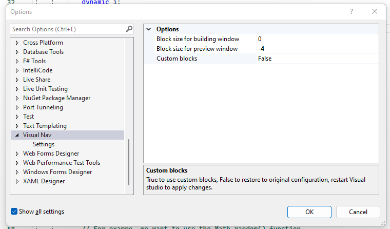
Settings ⚙️
User settings are saved via a setting menu connected with Visual Studio.
Currently these restore or update the zoom size for blocks in the preview and building panel as well as to reset the user's custom block collection.
Settings make it possible to for the configuration to be persistent. If Visual Studio is reopened, the settings will stay in place, improving user experience. Settings can be expanded for upcoming teams.
[Category("Options")]
[DisplayName("Custom blocks")]
[Description("True to use custom blocks, False to restore to original configuration, restart Visual studio to apply changes.")]
[DefaultValue(false)]
public bool CustomBlock { get; set; } = false;
Configuration value for Custom Block
Keyboard shortcuts & commands
The application supports 8 new shortcuts for commonly used actions. Each shortcut contains a handler class, which calls the tool window method. Anelia Gaydardzhieva, the Motion Input lead, collaborated closely to make sure voice commands could be used to trigger these and a few other popular shortcuts from motion input.
Understanding essential concepts
Everything you need for using the Extensions Toolkit to understand the concepts behind Tool Window, Commands, and the Visual Studio API: is available below thanks to official Microsoft documentation.